She Matters

Women-centred branding

Empowering refugee and migrant women

When the founder of She Matters told me about her new initiative, I didn’t hesitate to join her. We were full of enthusiasm, but we faced a challenge of many young social enterprises: building the brand from scratch with no budget.

What?

Brand design
Print and digital design

When?

2017
(in use until May 2019)

for whom?

Source of photographs 1, 2 and 3: She Matters

First: the logo

The organisation represents migrant women from different backgrounds, cultures and races. It was challenging to create a logo that could represent all women of the world, without suggesting specific identity (for example a person wearing a hijab). It should be attractive to both migrant women applying to She Matters programme, as well as to customers, who intend to hire them.


Selected symbol shows just a face which looks up, in two shades of purple. There is also a second version of it, adjusted for the Lotus Flower Training Programme, with a flower replacing female face.

Discarded projects:

Final result:

Corporate communications tools

Here’s what I prepared:

Key visuals

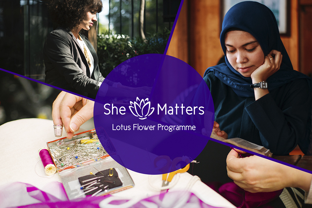
Purple circles became a key visual of the brand, as well as the lotus flower symbol.
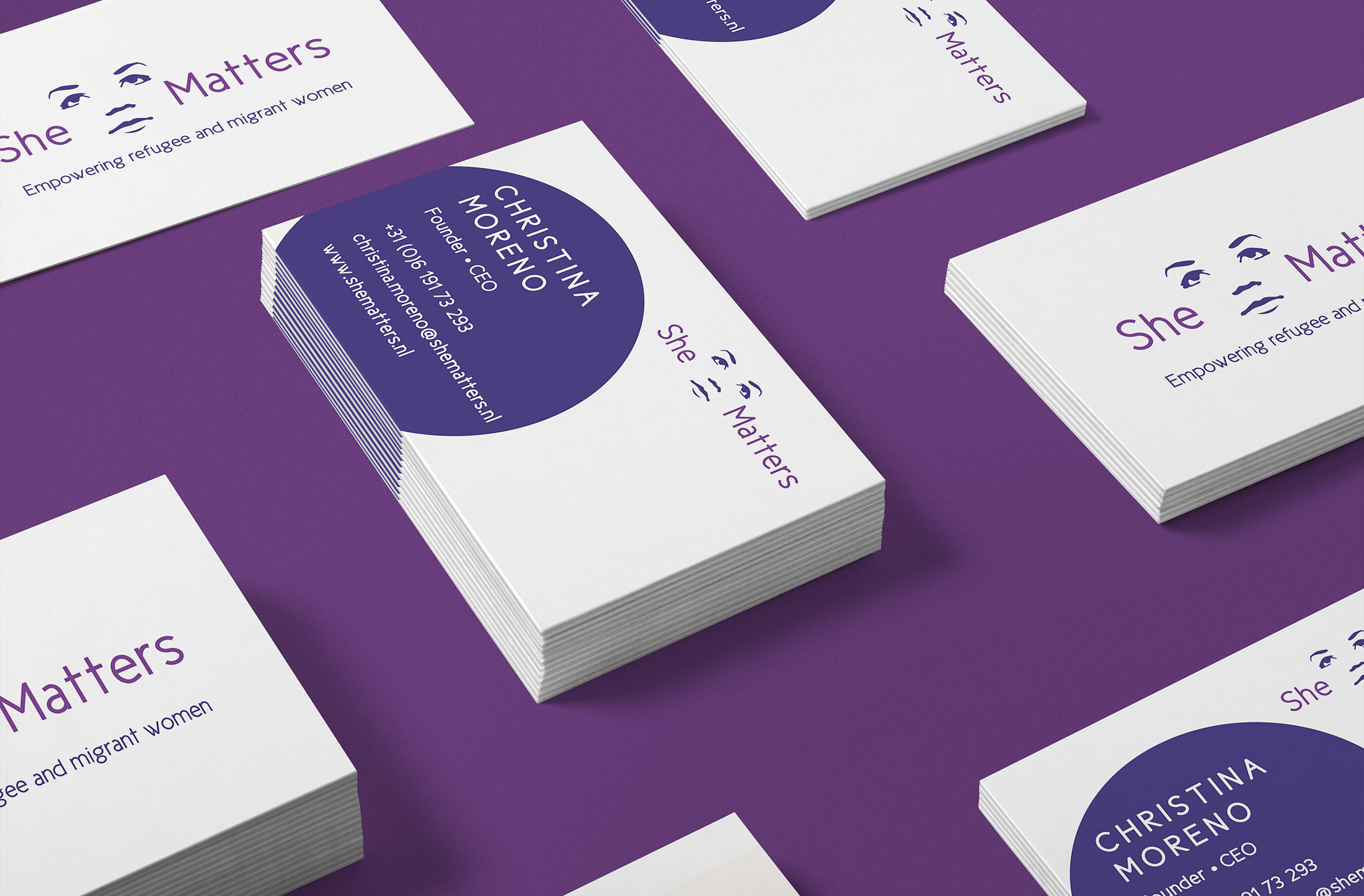
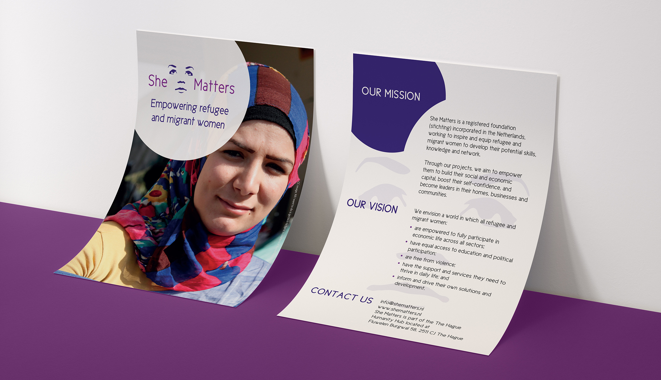
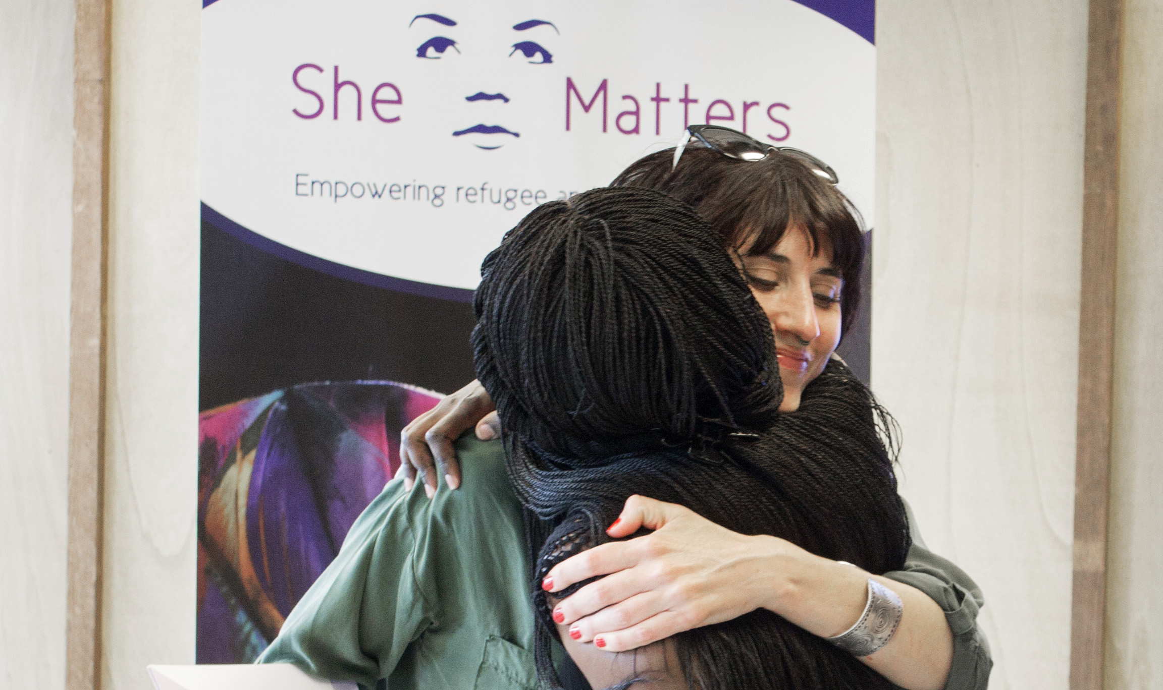
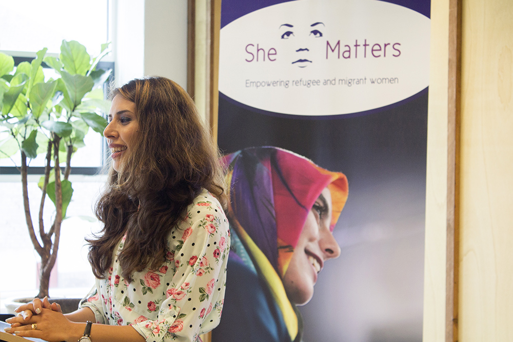
Printed materials

Designed business cards, flyers, posters, a rollup banner.

Corporate templates

Prepared a letterhead, report template, invoice template, presentation template. The templates were designed in Google Docs, Google Sheets and Google Slides, to make collaboration easier for She Matters team.

Social media visuals

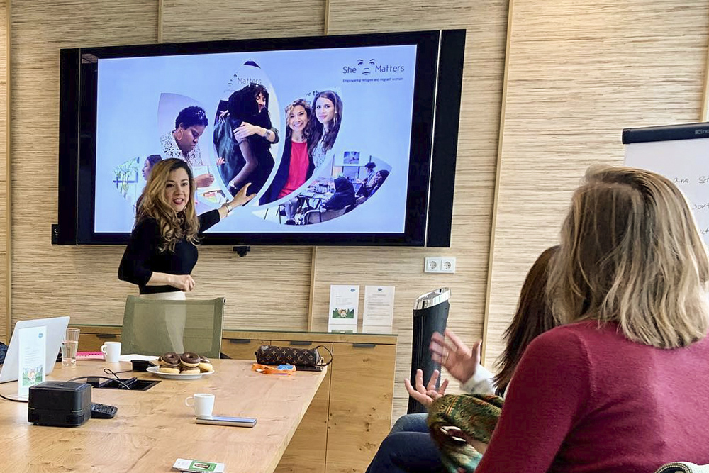
Prepared a set of social media visuals and image covers. I also wanted to empower the She Matters team to make their own social media visuals. They did not have any professional software for editing images, so I suggested adjusting my templates in PowerPoint or Google Slides.

Photographs

Before we could take our own photographs with the target group and use them, I relied on images with Creative Commons license.