HiiL website

New website for “new”, user-centred HiiL

Making website easier to use

Being part of HiiL (short for The Hague Institute for Innovation of Law), I was assigned with – and personally pushed for – refreshing our corporate website. The previous website was unresponsive and full of unstructured content. Its design wasn’t aligned with our rebranding, which took place in 2018 and it focuses on two values: being user-friendly and behaving in a friendly rebel way.

What?

Preparing the brief
Project management
Web design
Usability testing

When?

2017-2018

The result:
With whom?

The Zooooo team:  Irene Koel – marketing strategy;  Jeroen Hessing – web development;  Jeroen van Zwam – art direction;  Sikko Gerkema – copywriting;  Remco van Nieuwenhoven – UX advice, website structure;  Katerina Kamprani – artwork in the hero image 


Ieva Putriuvyte – UX research


Leapforce – transfer of the old content to the new website


Colleagues from HiiL – feedback and content

The process

The process starting from finalized brief to the website launch in October 2018 took approximately 10 months. It included collaboration with external experts, but also gathering input from my colleagues from HiiL.

  • Preparing a brief
    Listing goals of the new website, defining the target audience, drafting personas. At this stage, I used UX research that Ieva Putriuvyte conducted on our former website.
  • Creative concept and planning
    Together with The Zoooo team we started working together on the creative concept and project planning.
  • Brainstorming the structure
    We had data on what worked and what didn't work on the old website. We gathered input on future needs. So it was time to prepare first outline of the new website structure.
  • First wireframes + testing
    The web developer prepared interactive wireframes visualising the new structure. I tested them with external users as well as internal team.

    The outcome led to the next round of improvements in the website structure.
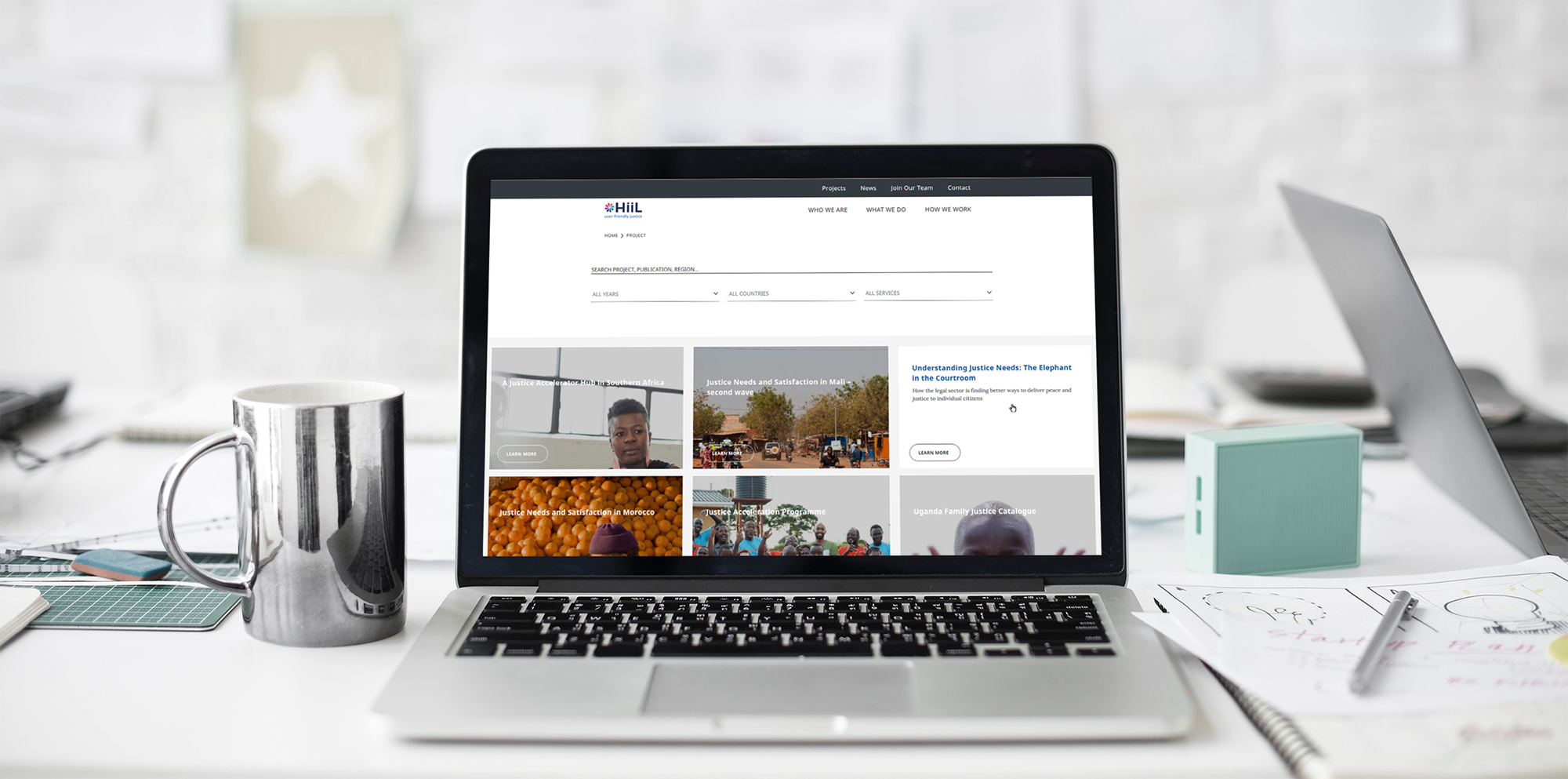
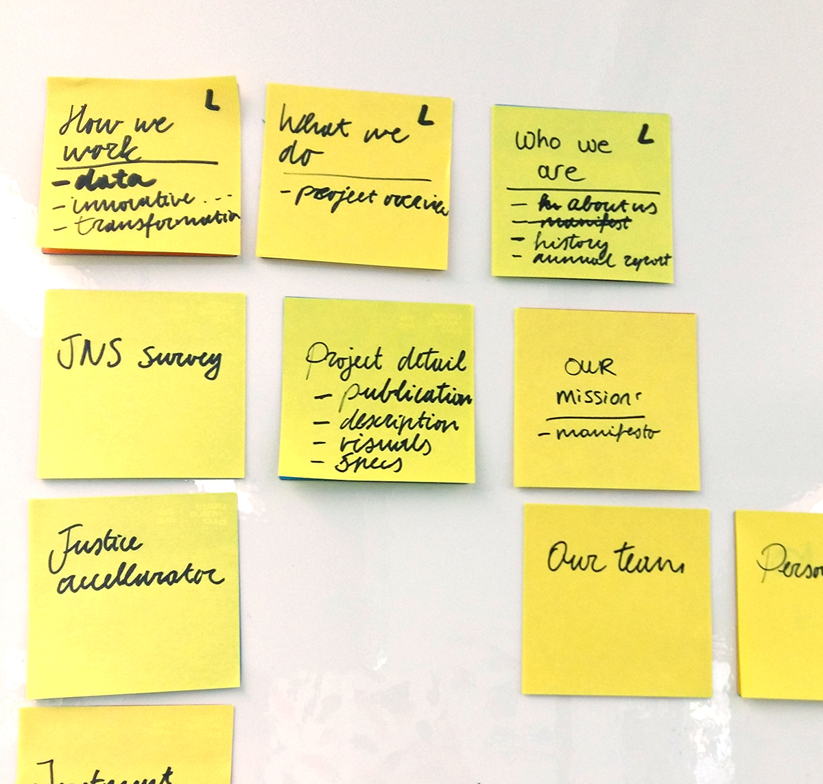
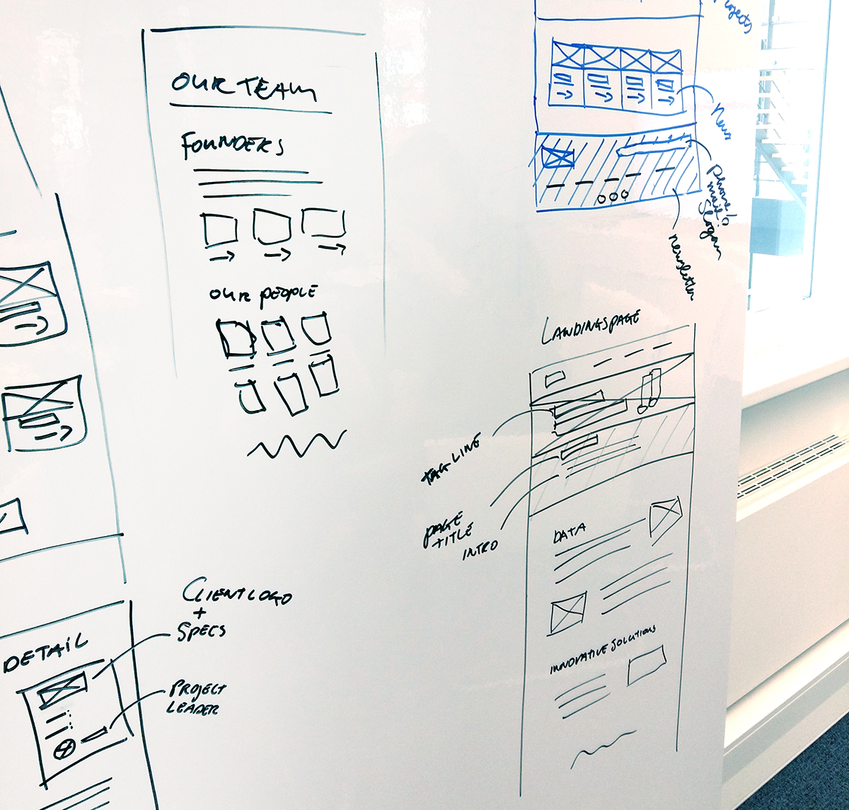
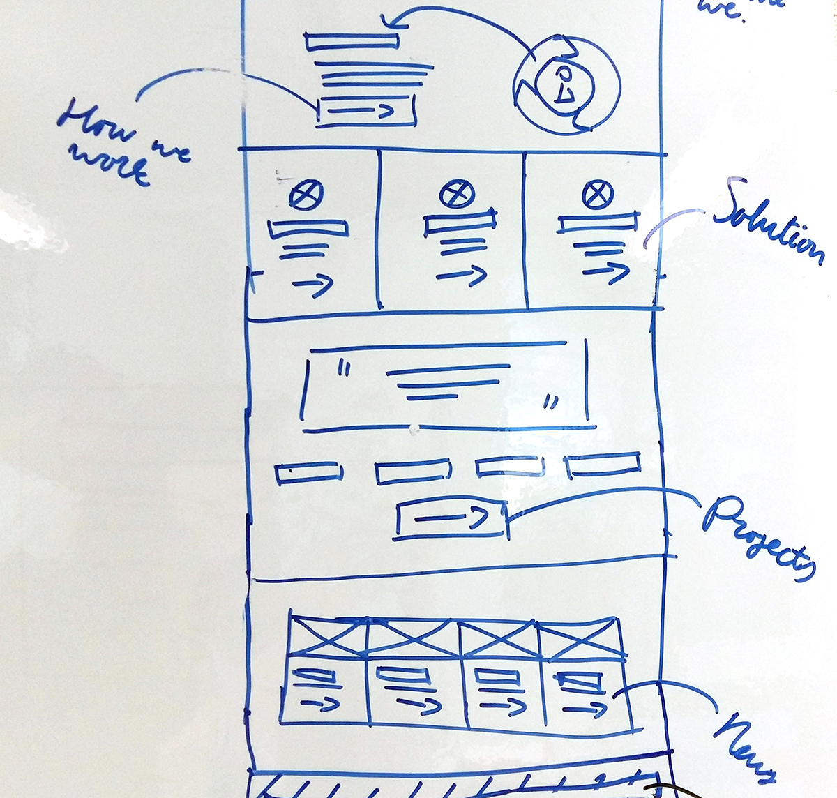
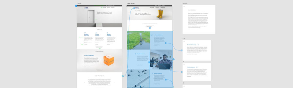
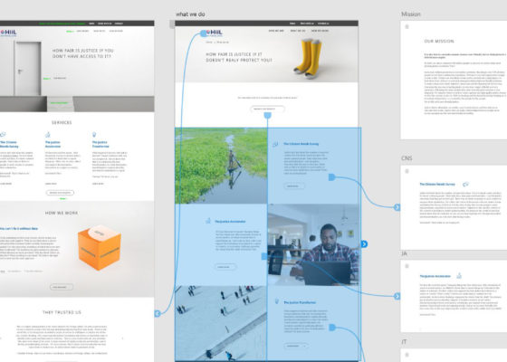
  • Prototyping + testing
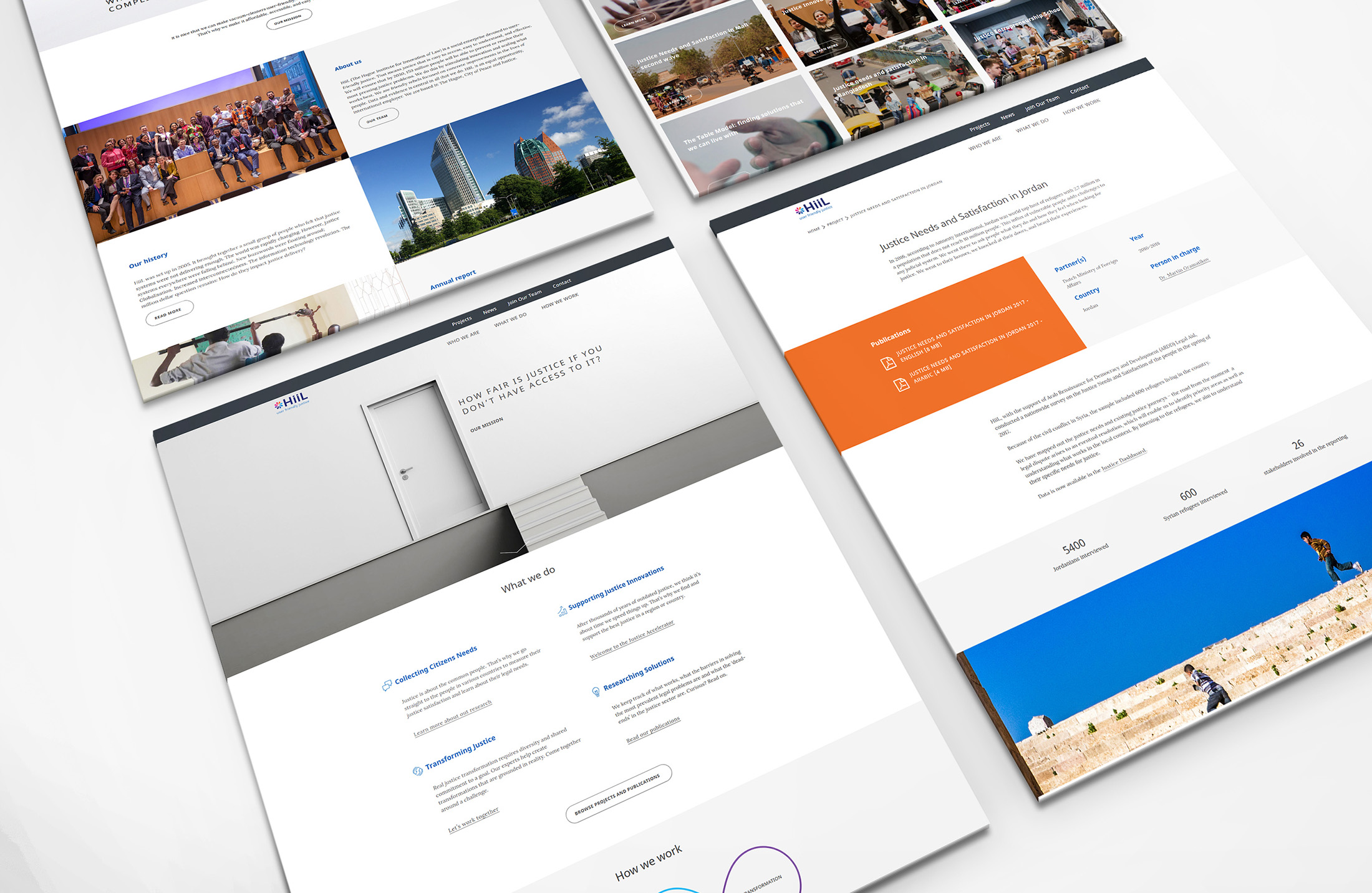
    We worked together with the Zoooo on the visual interface. When I finished designing the landing page and main subpages, the next step involved evaluating them in two in-depth user sessions. After that I prepared an interactive prototype in Adobe UX. Because user testing was crucial at every step!

    I organised four user testing sessions, followed by next round of improvements. The final iteration of the prototype was tested on six people.
  • Working on the content
    In parallel, we worked with internal HiiL team on the content of the new website. The Zooooo helped us with writing the texts for the main pages.
  • Implementing improved prototype
    It was time to implement the new website! The web developer worked hard on the back- and fronted. I made tweaks to the interface and added the content to main pages.
  • Transferring content from the old website
    We made careful decisions about which project pages and blogs should be transferred to the new website. IT specialists from Leapforce helped us with the migration.
  • Finalizing new website
    After fixing the majority of bugs, the website was launched in October 2018.
Let’s compare: old landing page versus new landing page
The look and feel: